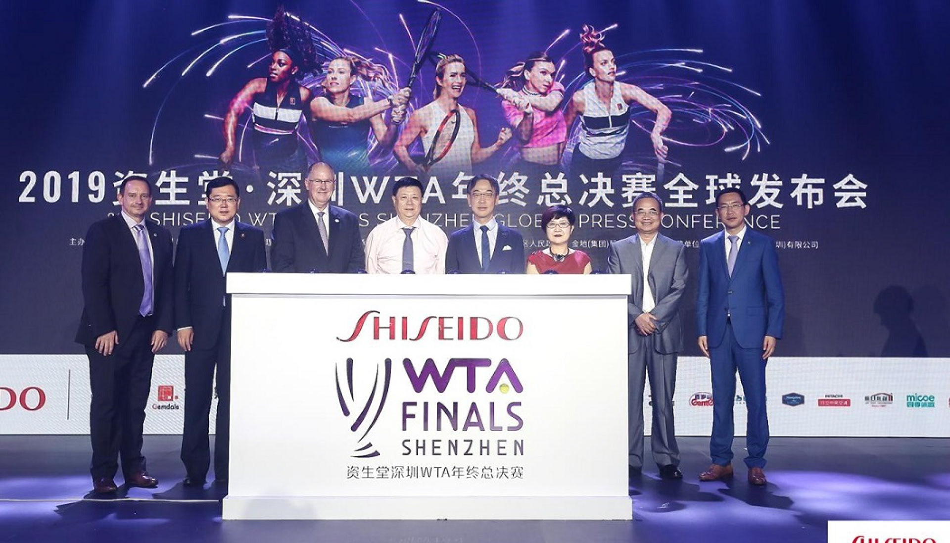
Creating an exhilarating identity for the WTA Finals Shenzhen
THE CHALLENGE
The WTA Finals is the culmination of the world’s best professional women’s tennis event. And in 2019, it would find a new home in China’s fastest progressing city, Shenzhen.
And while the WTA Finals is considered the fifth most prestigious tennis event globally, after the four Grand Slam tournaments, it is does not have the same awareness in China.
Superunion was challenged to garner support of the Chinese audience and put the WTA Finals Shenzhen on the map of international women’s tennis.
BRAND IDENTITY
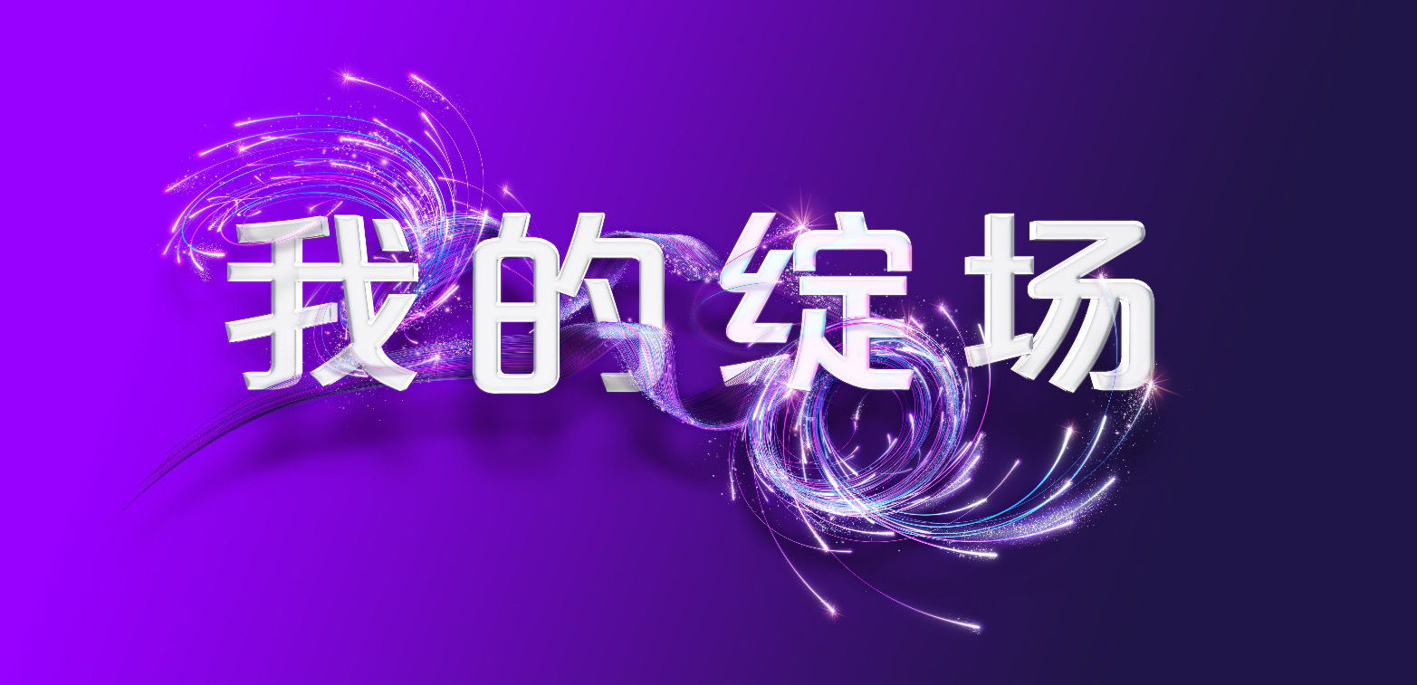
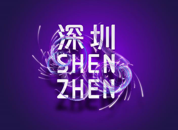
Our WTA Finals Shenzhen brand mark takes cues from the fluid and electric graphic device that embodies the glistening glory of the game and energy of Shenzhen.
The brand identity is formed by two sets of actives lines that represent the back and forth, momentum swing of the tennis game. The lines also represent the iconic and prestigious Billie Jean King and Martina Navratilova trophies, for which our singles and doubles finalist will fight to hoist high.
The typography of the brand mark represents our signature, elite event, uplifting our sport in China, Asia, and around the world. Strong and structured Raleway complement the smooth curves of Oswald to mirror our brand mark, with both rounded and squared terminals to evoke a contemporary, fierce and feminine brand.
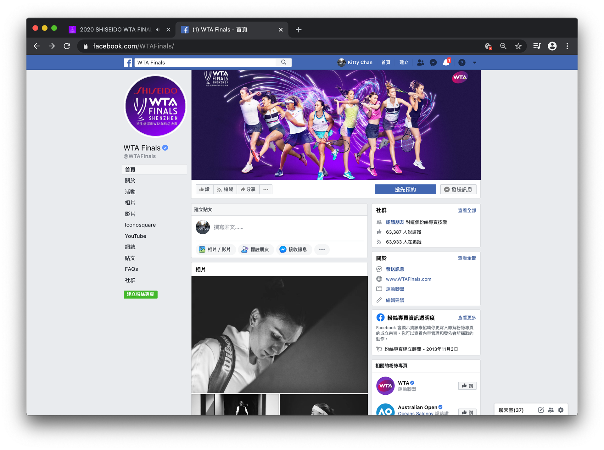
We also developed the supergraphic for the brand, representing the surging electrical sparks created when the WTA Finals comes to life in its home of Shenzhen. The blue light graffiti lines are representative of the technological flair of the Shenzhen, while the purple lines represent the vivacity and power of the WTA.
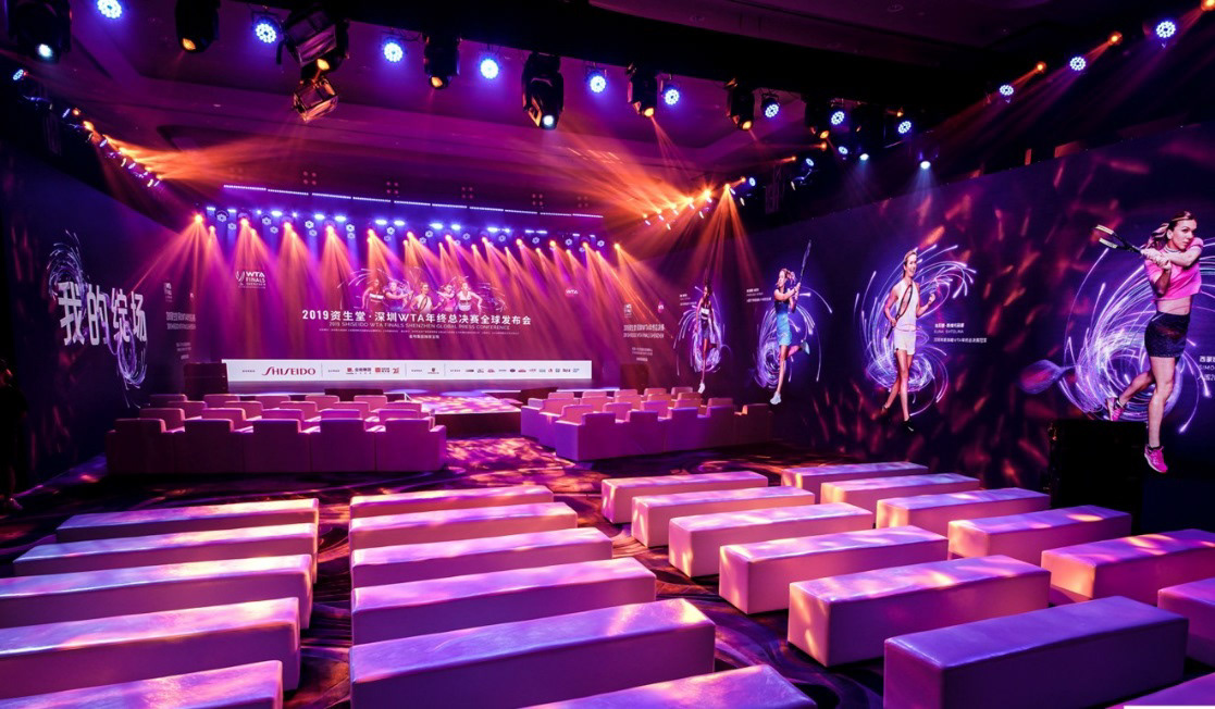
The brand identity applied on the main arena
Shenzhen skyline displayed the brand identity during the week of the Finals


