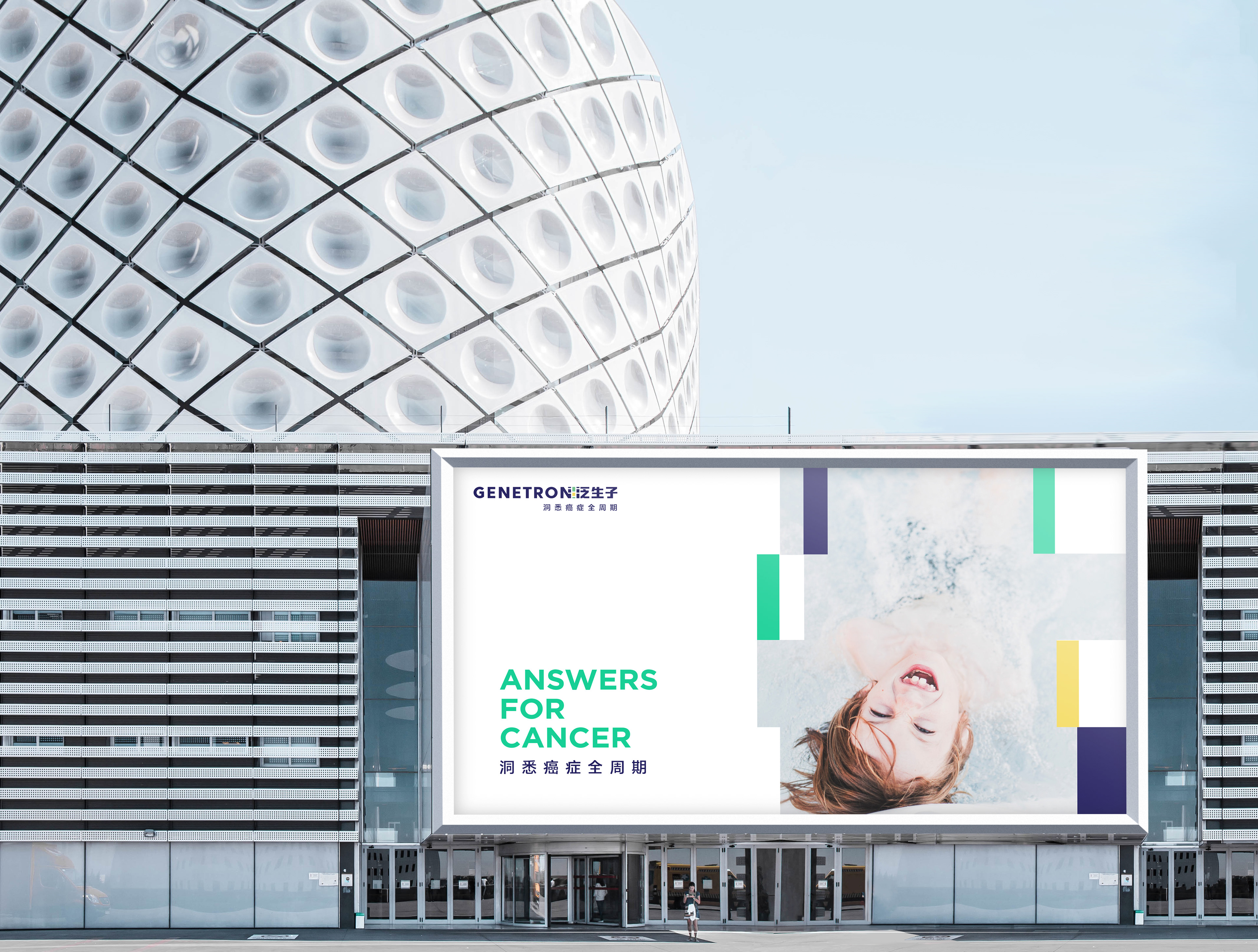
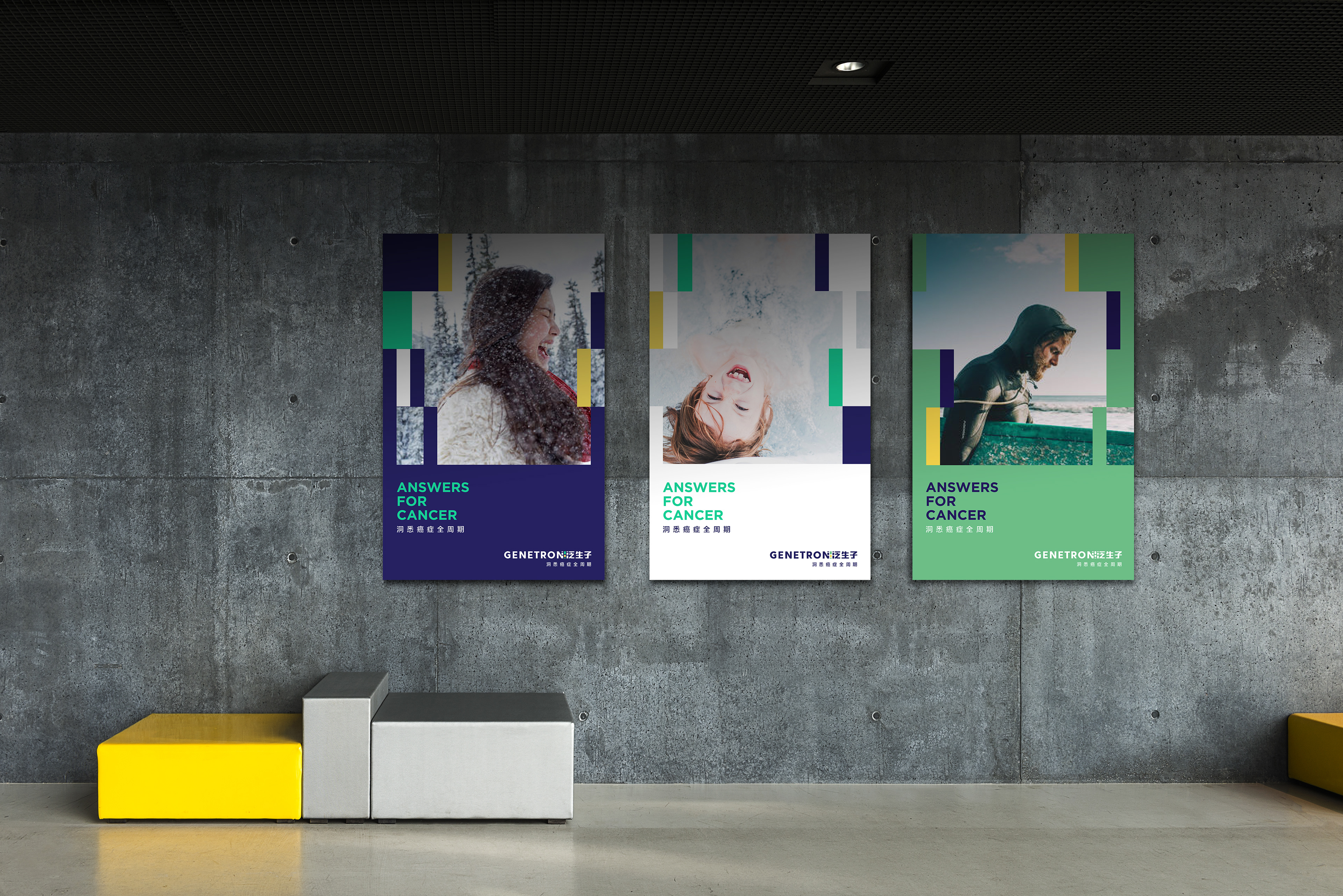
Finding answers for cancer
Genetron Health is a cancer genomics company, whose services cover the entire cancer life-cycle. Their primary product are genetic tests that allow cancer patients to understand which specific genetic mutation has caused tumor growth. In turn, this allows doctors to prescribe targeted drugs meant specifically for patient’s particular type of tumor.
As Genetron Health approached a critical growth juncture in mid 2018, it sought a new brand strategy and visual identity that would help it create differentiation and distinctiveness amongst a large number of competitors, as well as tell the story of its business ambitions.
Brand Identity
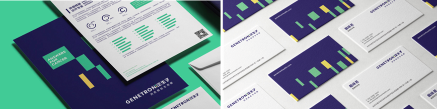
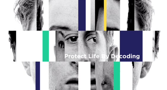
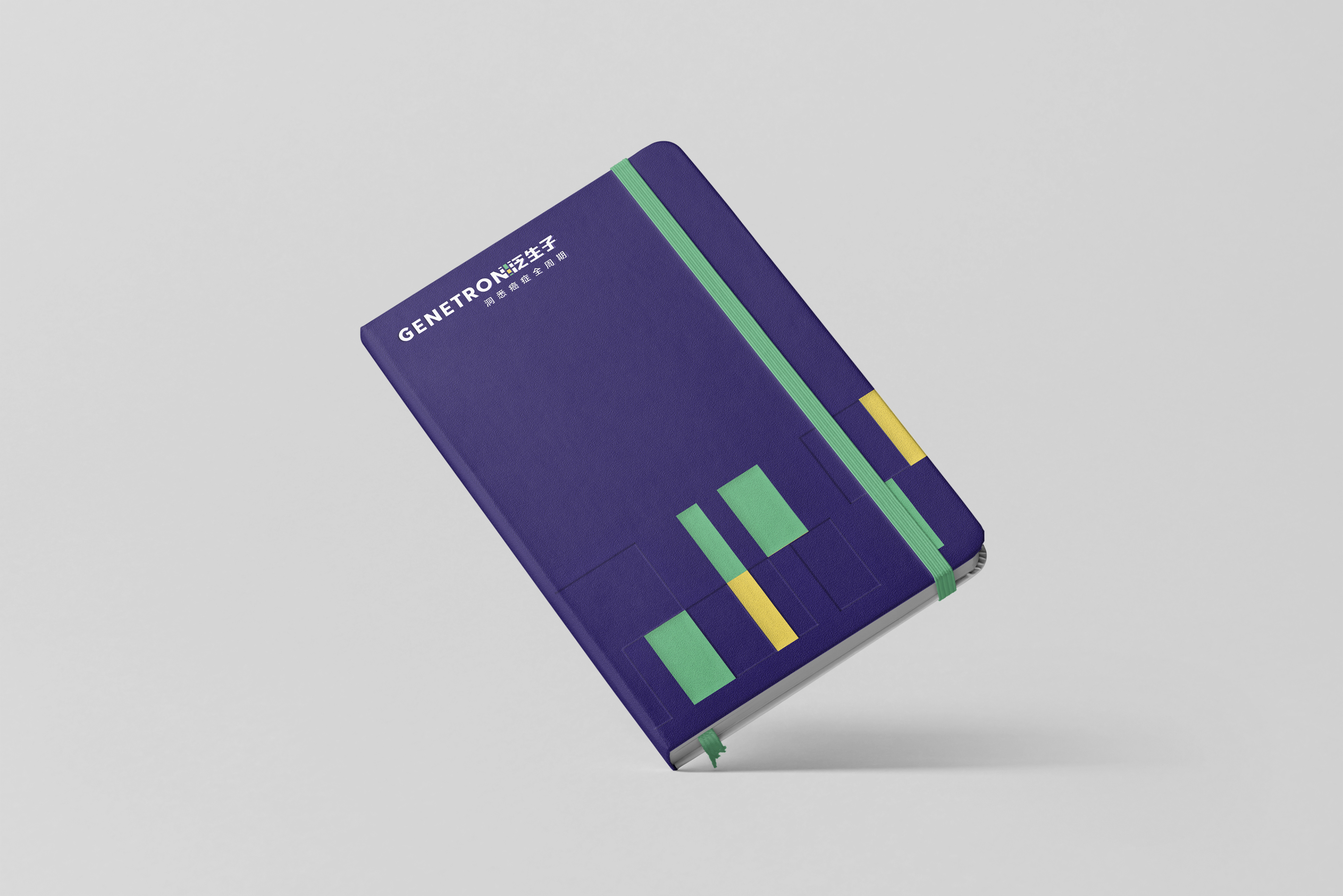
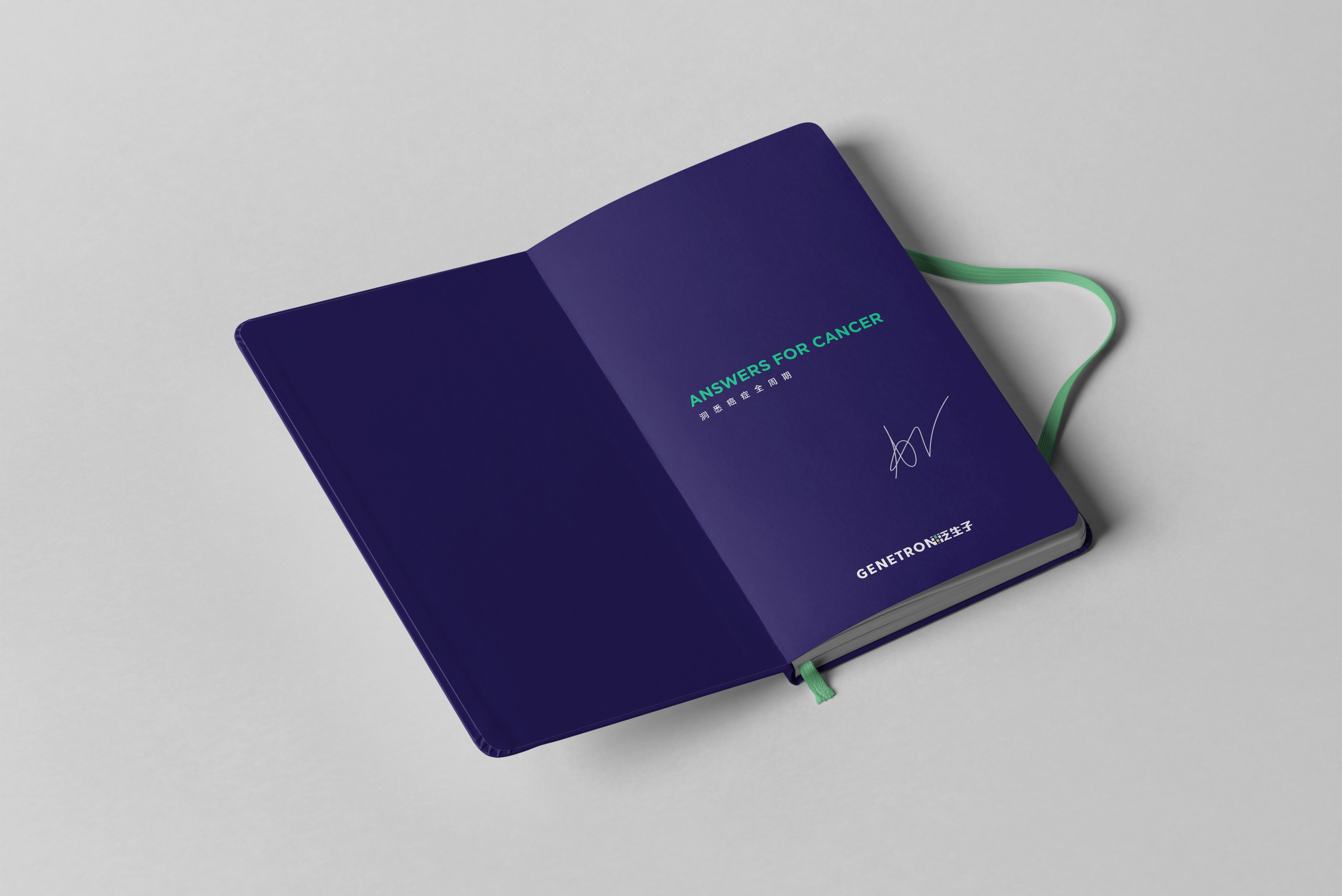
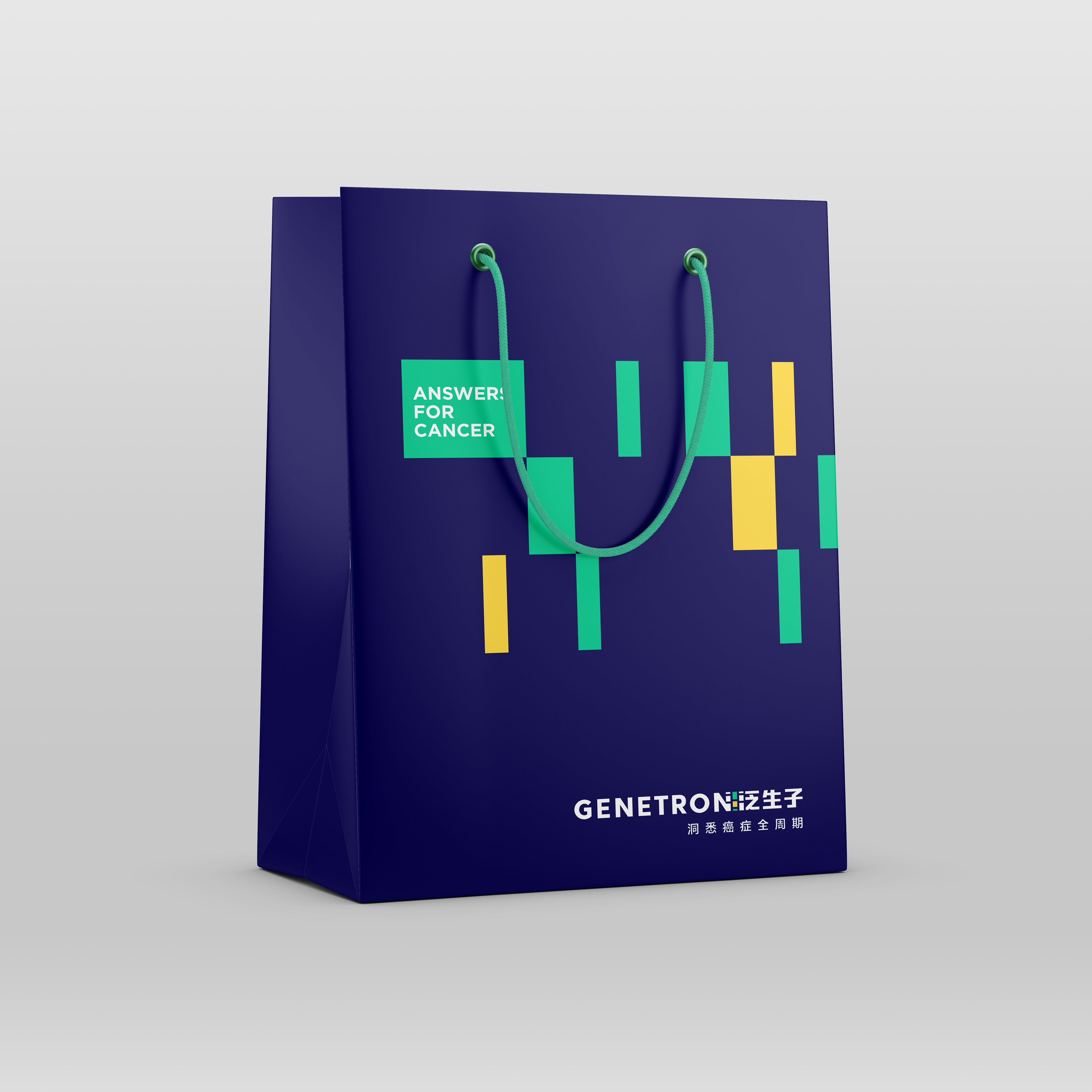
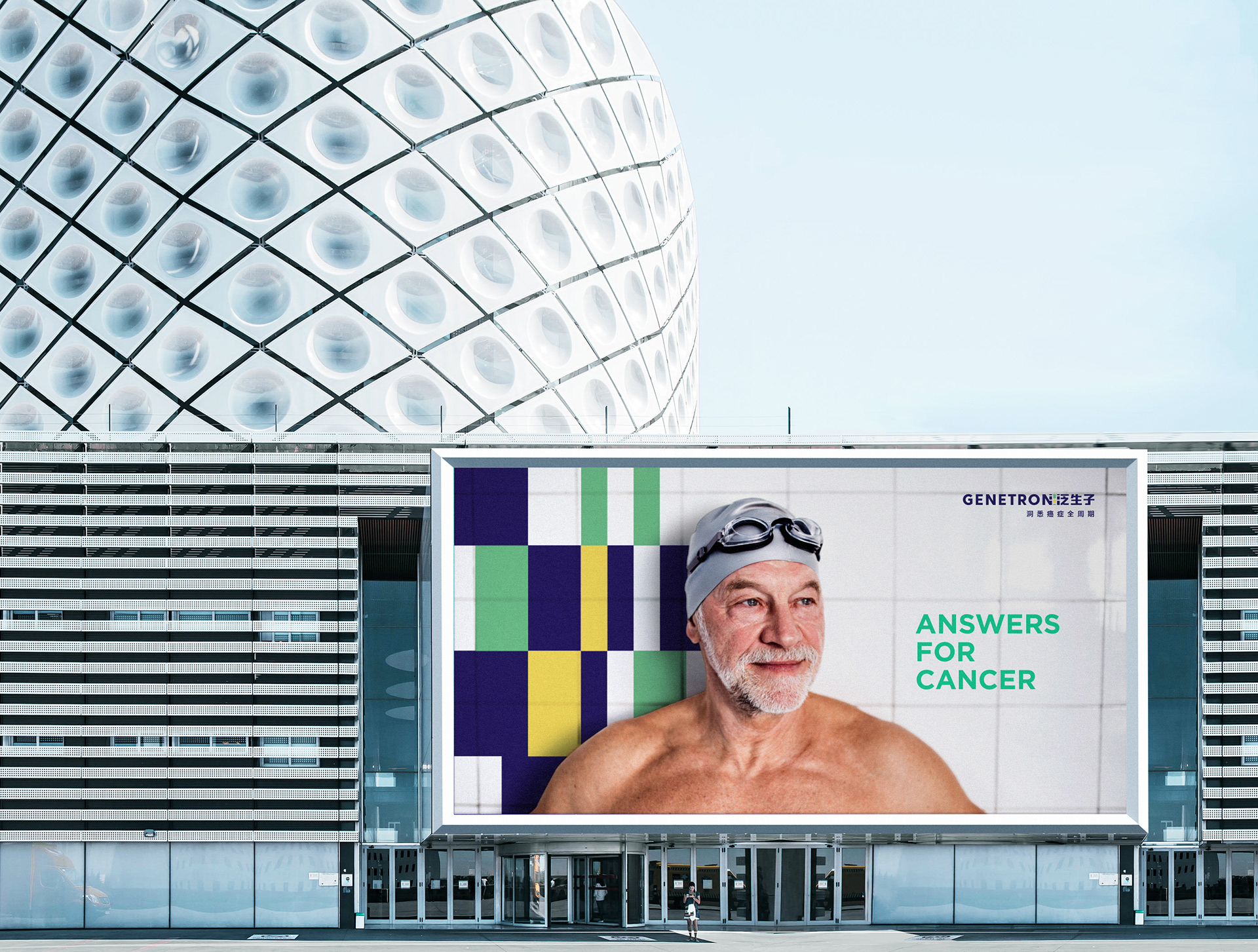
Genetron Health’s existing visual identity was characterized by adherence to dominant industry codes – clinical colors, hard-edged fonts, and a graphic depicting a double helix, giving it little distinctiveness compared to competitor identities, whom also primarily use visual identities centered around a double helix graphic. We crafted a logo and animated key graphic inspired by the act of “decoding” – showing how Genetron Health protects life by providing “Answers for Cancer”.
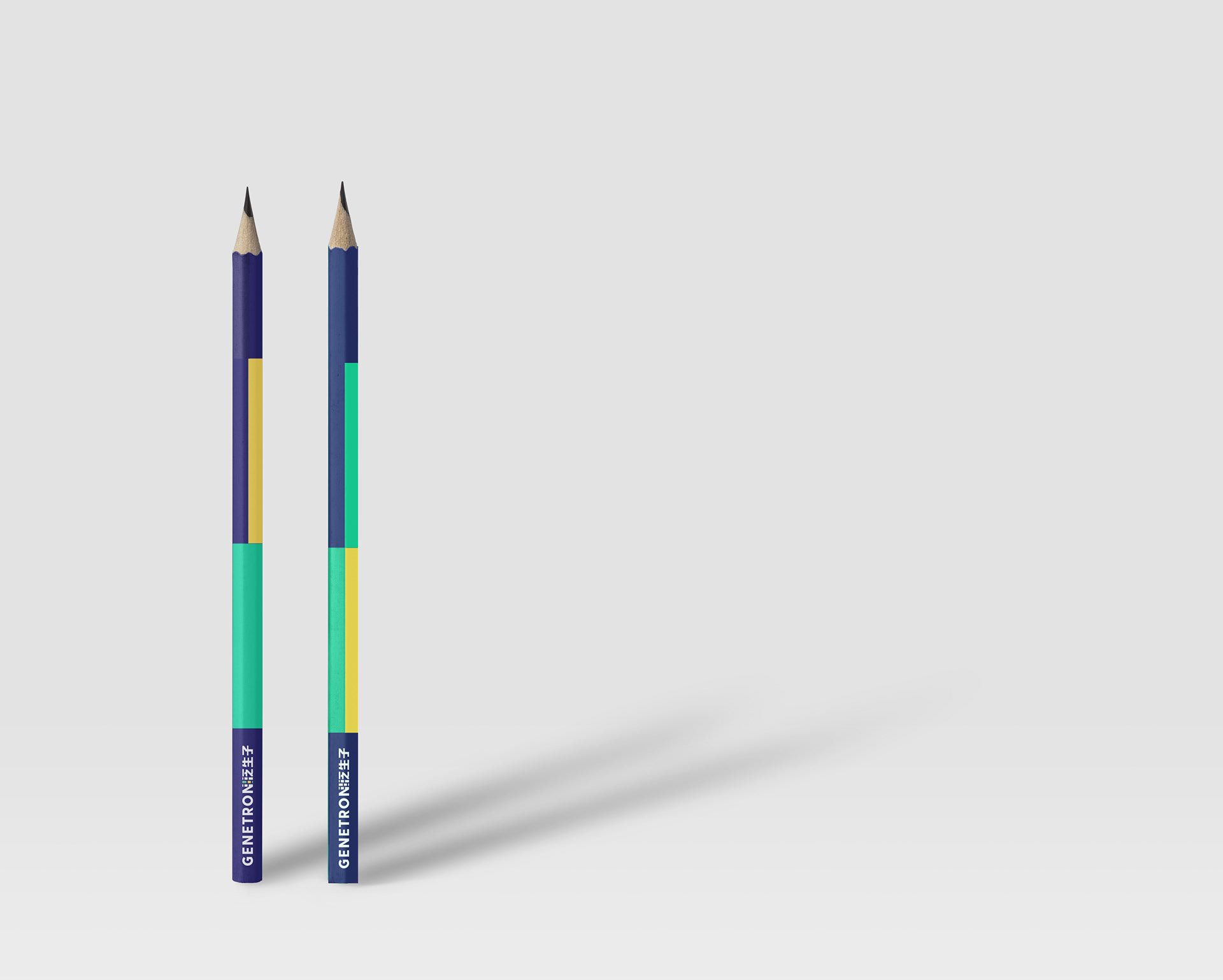
3 distinctive colors were chosen – ocean blue, sea green, and golden yellow – with ocean blue representing professional wisdom, sea green representing human vitality, and golden yellow representing hope and warmth.

CREATIVE TECH For a tech health company
A big part of our solution was to developed from the ground up, a custom-made design tool for them. Using nothing but code, we've created a solution to their design system, that they can control and output themselves, without any tech or design knowledge. As simple as that, they can create animated key visuals or infinite variations of their dynamic logo.
The custom-made design tool we've built from code, enabling the client to output infinite dynamic assets of their brand.